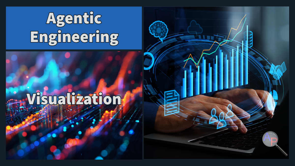
Agentic Visualization
Agentic Engineering continues by expanding from coordination into Agentic Visualization. After agents generate models, experiments, and results, the next challenge is presenting those results in a way that people can understand and act upon.
Visualization transforms raw outputs into insights. Effective visualizations reveal patterns, highlight problems, and communicate the meaning of results. In an agentic workflow, specialized tools and agents can help generate charts, dashboards, and presentations, but the human engineer must still ensure that the visuals are accurate, meaningful, and aligned with the project objectives.
Good visualization turns data into decisions.
From Data to Decisions
Engineering projects often produce large volumes of numbers: logs, metrics, model predictions, experiment results, and performance statistics. Without visualization, these results are difficult to interpret.
Visualization bridges the gap between analysis and understanding. Well-designed charts help identify relationships, anomalies, and trends that would otherwise remain hidden.
Effective visualizations usually follow a simple principle: each figure should communicate a single clear message. When a chart answers a specific question, it becomes a tool for decision-making rather than decoration.
Visualization Agent Roles
In an agentic workflow, visualization tasks can also be delegated to specialized agents. These agents help generate figures, dashboards, and summaries while the human engineer validates the results.
Role: Select the appropriate visualization type and layout.
This agent analyzes the structure of the data and suggests appropriate chart types. For example, scatter plots reveal relationships between variables, time series plots show trends over time, and bar charts compare categories.
The goal is to ensure that the visualization communicates the intended relationship clearly and avoids unnecessary complexity.
Role: Create dashboards that summarize key metrics.
This agent aggregates important indicators into a single interactive view. Dashboards help teams monitor systems, evaluate model performance, and detect problems early.
Typical dashboards may include model accuracy metrics, experiment comparisons, operational statistics, or system health indicators.
Role: Identify patterns and summarize findings.
This agent reviews results and highlights important observations. It may identify trends, correlations, anomalies, or areas where the model performs poorly.
The output is typically a short summary explaining what the results mean and what actions might be taken next.
Role: Convert technical results into clear explanations.
This agent prepares figures and slides that explain the results to stakeholders. It may organize charts into a narrative that explains the problem, the analysis, and the implications.
The goal is to make technical work understandable for decision makers.
Dashboarding and Monitoring
Dashboards are one of the most powerful tools for transforming engineering results into actionable insights. Instead of reviewing individual charts, teams can monitor key indicators in real time.
Examples include:
- model accuracy and prediction error
- system performance and latency
- experiment comparisons across parameter settings
- operational metrics such as throughput or reliability
Dashboards allow engineers and managers to quickly understand the current state of a system and detect issues before they become serious.
Modern visualization tools allow dashboards to update automatically as new data arrives.
Example: Visualizing Model Performance
Consider a machine learning model that predicts a physical quantity. A simple scatter plot comparing predicted values with measured values can immediately reveal how well the model performs.
Points close to the diagonal line indicate accurate predictions, while large deviations indicate areas where the model may need improvement. Such visual comparisons help engineers quickly assess model quality and identify outliers or systematic bias.
Visualizations like this allow teams to evaluate results far faster than reviewing tables of numbers.
AI-Assisted Visualization
Generative AI tools can assist with visualization tasks such as summarizing data, generating chart prototypes, or creating dashboard layouts. These tools can accelerate the design process by quickly suggesting ways to present the data.
However, visualization still requires careful engineering judgment. The engineer must verify that the data are correct, that axes are labeled properly, and that scales do not distort the underlying relationships. Clear labeling and concise annotations help ensure that visualizations communicate the intended message.
AI accelerates the process, but the responsibility for accuracy remains with the engineer.
Bringing Results to Life
Visualization is not just about charts. Effective engineering communication may include dashboards, interactive plots, reports, or presentations.
Agentic workflows can help automate the creation of:
- experiment comparison plots
- performance monitoring dashboards
- automated reports summarizing model results
- presentation slides explaining findings
When results are presented clearly, teams can make decisions faster and with greater confidence.
Integrating Visualization into the Course Project
In the Machine Learning for Engineers project, visualization is essential for demonstrating that your solution works.
Students should develop figures that clearly communicate:
- structure of the data
- performance of the model
- comparisons between alternative approaches
- insights that lead to improved decisions
The goal is not simply to produce charts, but to reveal meaningful patterns and explain the implications of the results.
Key Takeaways
Visualization transforms technical results into understanding. Agentic tools can help generate charts, dashboards, and reports, but the engineer must ensure that the visuals communicate accurate and meaningful insights.
Strong visualization makes engineering work visible. It allows teams to evaluate models, detect problems, and communicate results effectively.
In the final lecture of this series, we will expand this idea further by focusing on communication, ensuring that engineering results lead to clear decisions and real-world impact.