Data Visualization and Exploration
Data visualization and exploration is one of the first steps in machine learning after the data is gathered and statistically summarized. It is used to graphically represent data to qualitatively understand relationships and data quality.

Visualization is the graphical representation of data while exploration is gaining an understanding of the data to make better informed decisions about how it can be applied. Visualization and exploration gives an understanding of data diversity, relationships, missing data, bad data, or other factors that may influence decisions to exclude or include an appropriate subset for training.


We will explore the Python packages that are commonly used for data visualization and exploration including pandas, plotly, seaborn, and matplotlib.
You may need to install Python packages from the terminal, Anaconda prompt, command prompt, or from the Jupyter Notebook.
Jupyter Notebooks automatically create a scroll bar if the output is above a certain threshold. Increase this limit by running this javascript code in a Jupyter Notebook code cell.
IPython.OutputArea.auto_scroll_threshold = 9999
This introductory exercise uses simulated data from the Temperature Control Lab (TCLab).
Warning: This script requires 5 hours to run because it is collecting 100 steady state points from the TCLab that require 3 minutes each. Use the generated data at https://apmonitor.com/pds/uploads/Main/TCLab_ss1.txt to avoid this wait time.
import tclab
import time
filename='TCLab_ss1.txt'
fid = open(filename,'w')
fid.write('Q1,Q2,T1,T2\n')
fid.close()
# Connect to Arduino
a = tclab.TCLabModel()
# random heater values
Q1d = np.random.randint(0,70,size=100)
Q2d = np.random.randint(0,80,size=100)
# collect 100 steady state points (~3 minutes each)
print('Wait 180 seconds between heater points')
print('Full data generation requires 5 hrs!')
for i in range(100):
# set heater values
a.Q1(Q1d[i])
a.Q2(Q2d[i])
# wait 300 seconds
time.sleep(300)
print('Set: ' + str(i) + \
' Q1: ' + str(Q1d[i]) + \
' Q2: ' + str(Q2d[i]) + \
' T1: ' + str(a.T1) + \
' T2: ' + str(a.T2))
fid = open(filename,'a')
fid.write(str(Q1d[i])+','+str(Q2d[i])+',' \
+str(a.T1)+','+str(a.T2)+'\n')
fid.close()
# close connection to Arduino
a.close()
The final activity gives you an opportunity to try the exploration and visualization approaches with photovoltaic (PV) simulated data from NREL PVWatts.
Pandas

Pandas visualizes and manipulates data tables. There are many functions that allow efficient manipulation for the preliminary steps of data analysis problems. Run the code below to read in the TCLab data file as a DataFrame data. The data.head() command shows the top rows of the table.
data = pd.read_csv('http://apmonitor.com/pds/uploads/Main/TCLab_ss1.txt')
print(data.head())
This prints the top rows of the table with the top 5 rows. You can also see the end with data.tail() or change the number of rows with data.head(10).
             Q1         Q2     T1     T2
   0  46.458549  65.722695  34.01  31.21
   1  52.920782  31.783877  40.30  31.11
   2  30.273413  14.655389  36.85  29.34
   3  97.817672  50.730076  49.23  31.28
   4  94.648879  91.025338  50.48  35.14
The data.describe() command shows summary statistics.
This produces basic summary statistics.
                  Q1          Q2          T1          T2
   count  120.000000  120.000000  120.000000  120.000000
   mean    47.889806   50.990620   39.455833   33.456500
   std     26.697499   29.894677    6.911408    3.598129
   min      3.103358    0.333330   26.860000   24.510000
   25%     24.454193   28.370305   34.185000   31.020000
   50%     43.829722   52.226625   37.400000   33.545000
   75%     73.543570   79.391947   44.842500   35.845000
   max     98.912891   99.991342   53.870000   42.650000
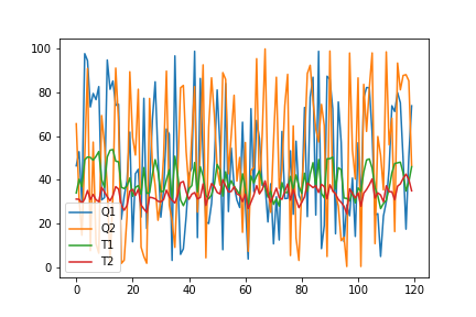
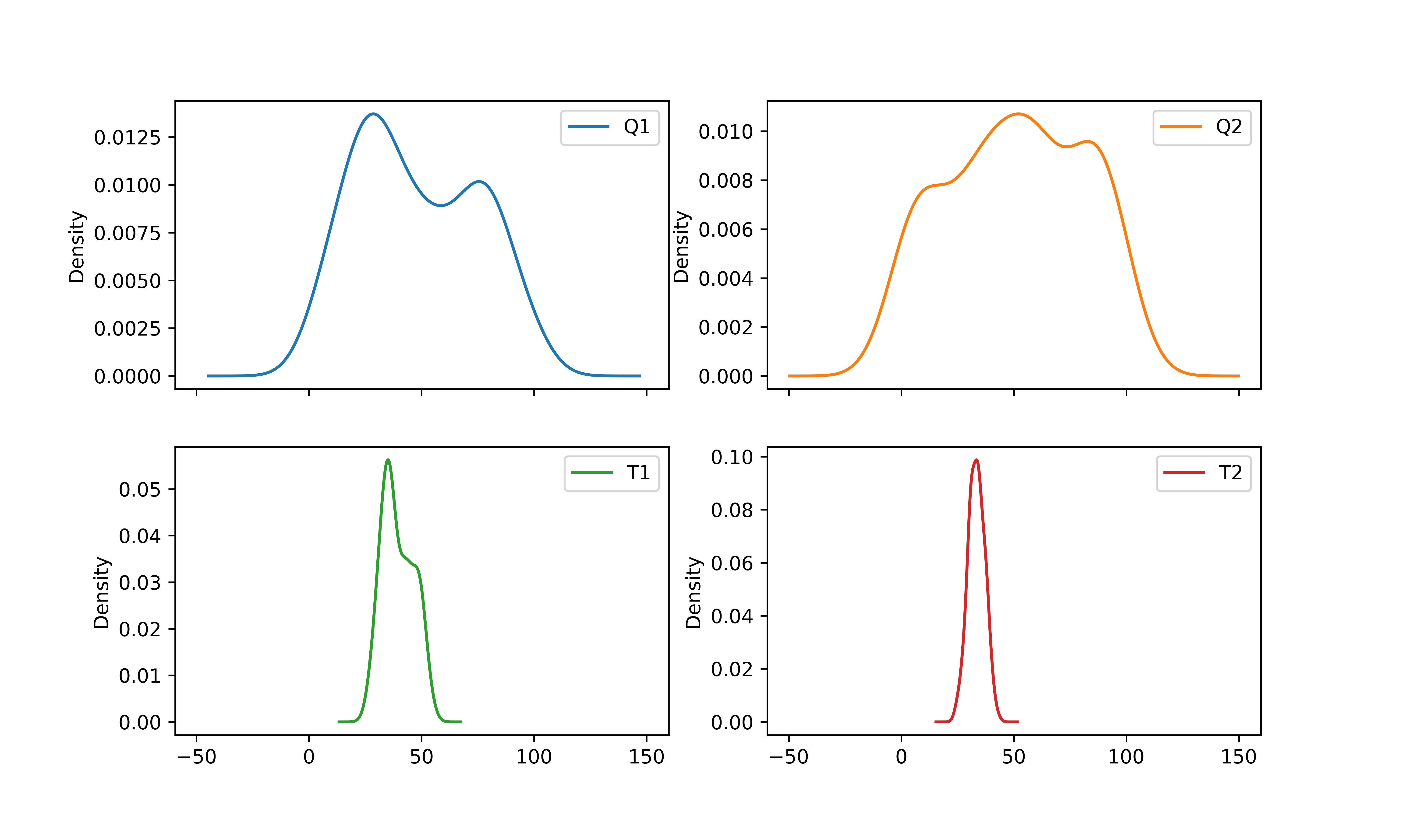
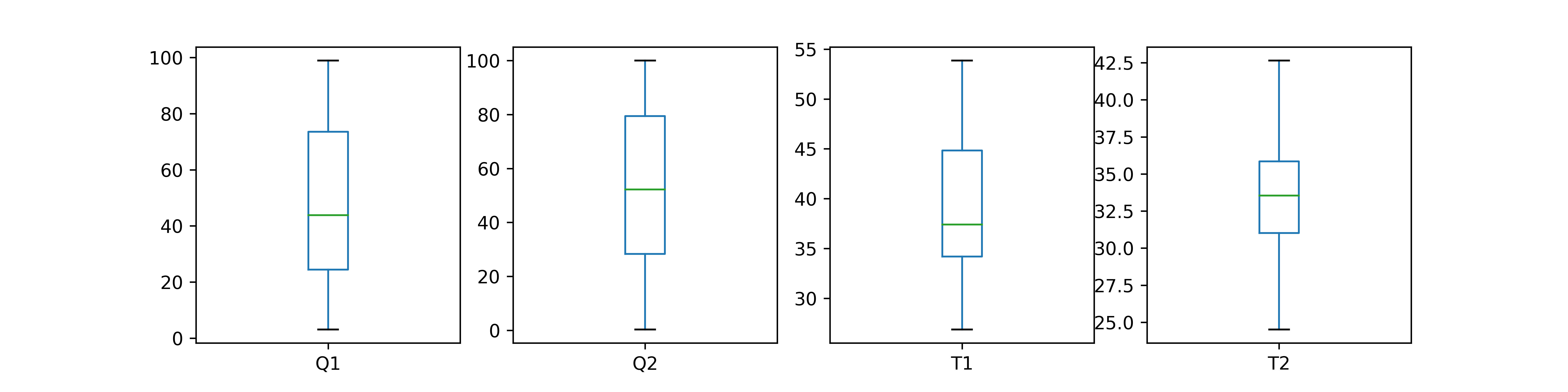
The data.plot() creates a plot with all of the data columns.
The optional parameter kind is the type of plot to produce.
- line : line plot (default)
- bar : vertical bar plot
- barh : horizontal bar plot
- hist : histogram
- box : boxplot
- kde / density : Kernel Density Estimation plot
- area : area plot
- pie : pie plot
- scatter : scatter plot
- hexbin : hexbin plot
Matplotlib

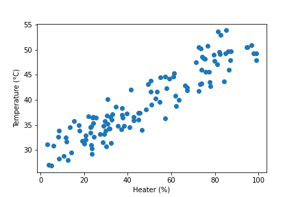
The package matplotlib generates plots in Python. Run the code to create a basic scatter plot.
plt.scatter(data['Q1'],data['T1'])
# add labels and title
plt.xlabel('Heater (%)')
plt.ylabel('Temperature (°C)')
plt.legend()
plt.show()
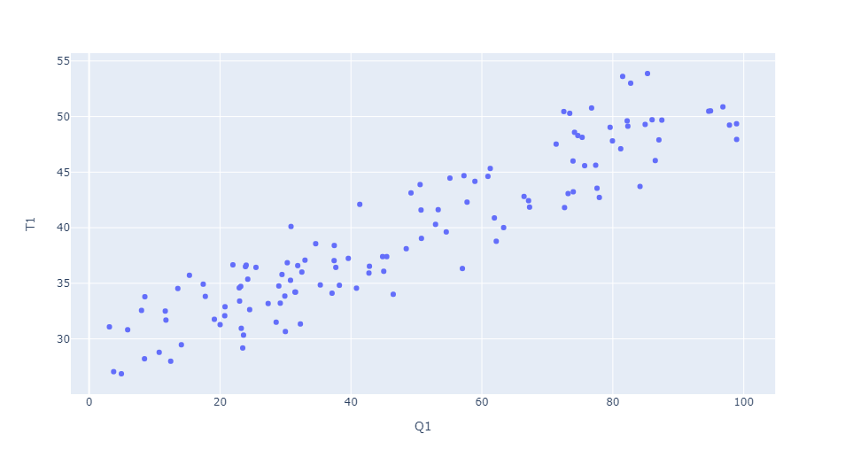
Plotly

Packages such as plotly and bokeh render interactive plots with HTML and JavaScript. Plotly Express is a high-level and easy-to-use interface to Plotly.
fig = px.scatter(data, x="Q1", y="T1")
fig.show()
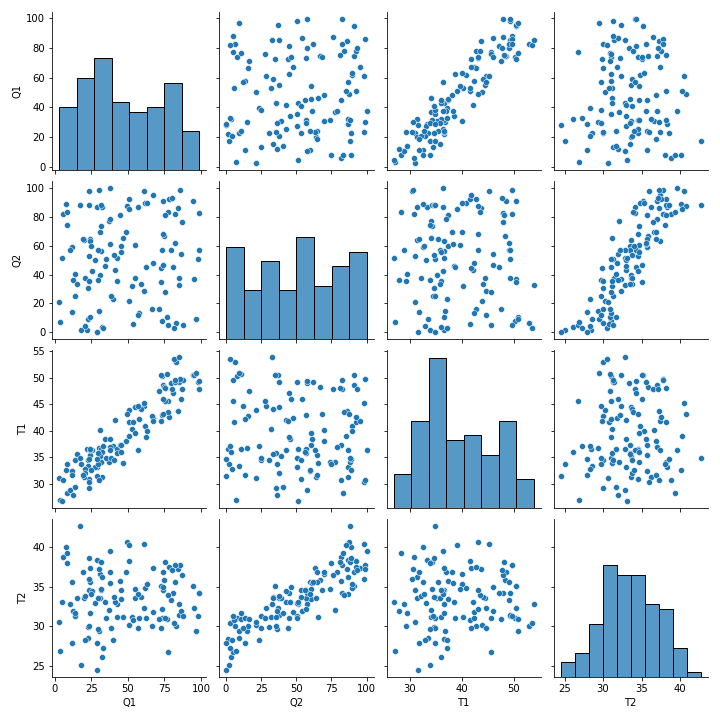
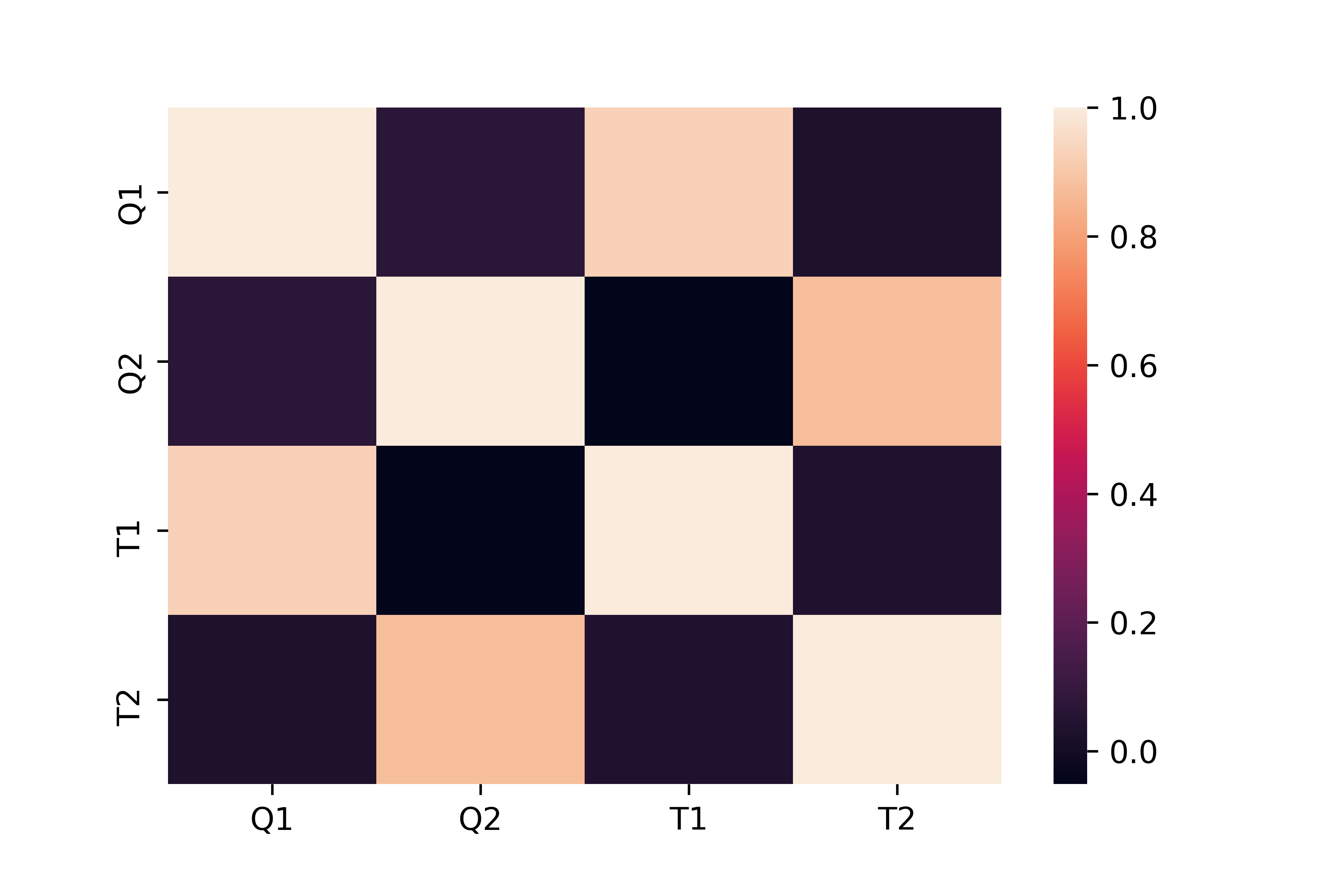
Seaborn

Seaborn is built on matplotlib, and produces detailed plots in few lines of code. Run the code below to see an example with the TCLab data.
sns.pairplot(data)
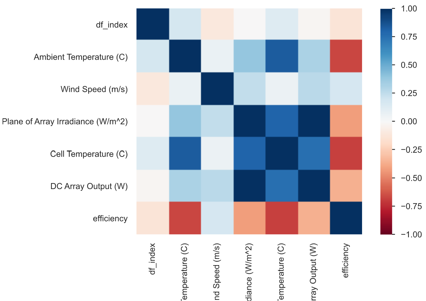
sns.heatmap(data.corr())

Activity

Explore data from PVWatts for BYU South Campus. PVWatts is a package from NREL to estimate the energy production and cost of energy of grid-connected photovoltaic (PV) energy systems. Investigate the specific data columns as factors listed below from all of the potential data factors.
df = pd.read_csv('http://apmonitor.com/pds/uploads/Main/PV_BYU_South.txt')
factors=['Ambient Temperature (C)',
'Wind Speed (m/s)',
'Plane of Array Irradiance (W/m^2)',
'Cell Temperature (C)',
'DC Array Output (W)']
Answer the following questions:
- What factors are highly correlated with DC Array Output (W)?
- What factors are highly correlated with Cell Temperature (C)?
- PV cells are more efficient at lower temperatures. Does the data also show this effect? Why or why not?
import seaborn as sns
import matplotlib.pyplot as plt
import plotly.express as px
df = pd.read_csv('http://apmonitor.com/pds/uploads/Main/PV_BYU_South.txt')
factors=['Ambient Temperature (C)',
'Wind Speed (m/s)',
'Plane of Array Irradiance (W/m^2)',
'Cell Temperature (C)',
'DC Array Output (W)']
print(df.columns)
data = df[factors].copy() # take only subset of data columns
# remove rows where there is no sunlight
data = data[data['Plane of Array Irradiance (W/m^2)']>0.01]
# calculate efficiency (use PV Cell m^2 to get true efficiency)
data['efficiency'] = data['DC Array Output (W)'] \
/data['Plane of Array Irradiance (W/m^2)']
print(data.head())
print(data.describe())
data.plot()
fig = px.scatter(data, x="Ambient Temperature (C)", \
y="Cell Temperature (C)")
fig.show()
sns.pairplot(data)
plt.figure()
x = data['Ambient Temperature (C)']
y = data['Cell Temperature (C)']
plt.scatter(x,y)
plt.xlabel('Ambient Temperature (°C)')
plt.ylabel('Cell Temperature (°C)')
plt.show()
Further Reading
- Brownlee, J., A Gentle Introduction to Data Visualization Methods in Python, Aug 23, 2019.
✅ Knowledge Check
1. What Python package is commonly used for data visualization and exploration and is built on top of matplotlib?
- Correct. Seaborn is a Python package used for data visualization and is built on top of matplotlib.
- Incorrect. While pandas is used for data manipulation and visualization, it is not built on top of matplotlib.
- Incorrect. Numpy is primarily used for numerical operations and is not a data visualization package.
- Incorrect. Plotly is a separate library used for creating interactive plots and is not built on matplotlib.
2. Which command is used to print the top rows of a DataFrame in pandas?
- Incorrect. There is no command named 'data.start()' in pandas.
- Incorrect. The correct command in pandas to show the top rows of a DataFrame is 'data.head()'.
- Correct. The 'data.head()' command is used in pandas to display the top rows of a DataFrame.
- Incorrect. There is no command named 'data.display()' in pandas.