Regression Statistics with Python
Regression is an optimization method for adjusting parameter values so that a correlation best fits data. Parameter uncertainty and the predicted uncertainty is important for qualifying the confidence in the solution. This tutorial shows how to perform a statistical analysis with Python for both linear and nonlinear regression.
Linear Regression
Create a linear model with unknown coefficients a (slope) and b (intercept). Fit the model to the data by minimizing the sum of squared errors between the predicted and measured y values.
$$y = a \, x + b$$
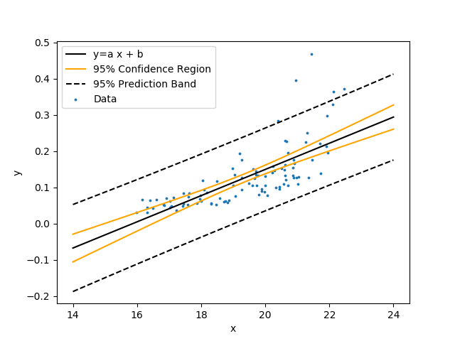
Show the linear regression with 95% confidence bands and 95% prediction bands. The confidence band is the confidence region for the correlation equation. The prediction band is the region that contains approximately 95% of the measurements. If another measurement is taken, there is a 95% chance that it falls within the prediction band. Use the following data set that is a table of comma separated values.

from scipy.optimize import curve_fit
import matplotlib.pyplot as plt
from scipy import stats
import pandas as pd
# pip install uncertainties, if needed
try:
import uncertainties.unumpy as unp
import uncertainties as unc
except:
try:
from pip import main as pipmain
except:
from pip._internal import main as pipmain
pipmain(['install','uncertainties'])
import uncertainties.unumpy as unp
import uncertainties as unc
# import data
url = 'http://apmonitor.com/che263/uploads/Main/stats_data.txt'
data = pd.read_csv(url)
x = data['x'].values
y = data['y'].values
n = len(y)
def f(x, a, b):
return a * x + b
popt, pcov = curve_fit(f, x, y)
# retrieve parameter values
a = popt[0]
b = popt[1]
print('Optimal Values')
print('a: ' + str(a))
print('b: ' + str(b))
# compute r^2
r2 = 1.0-(sum((y-f(x,a,b))**2)/((n-1.0)*np.var(y,ddof=1)))
print('R^2: ' + str(r2))
# calculate parameter confidence interval
a,b = unc.correlated_values(popt, pcov)
print('Uncertainty')
print('a: ' + str(a))
print('b: ' + str(b))
# plot data
plt.scatter(x, y, s=3, label='Data')
# calculate regression confidence interval
px = np.linspace(14, 24, 100)
py = a*px+b
nom = unp.nominal_values(py)
std = unp.std_devs(py)
def predband(x, xd, yd, p, func, conf=0.95):
# x = requested points
# xd = x data
# yd = y data
# p = parameters
# func = function name
alpha = 1.0 - conf # significance
N = xd.size # data sample size
var_n = len(p) # number of parameters
# Quantile of Student's t distribution for p=(1-alpha/2)
q = stats.t.ppf(1.0 - alpha / 2.0, N - var_n)
# Stdev of an individual measurement
se = np.sqrt(1. / (N - var_n) * \
np.sum((yd - func(xd, *p)) ** 2))
# Auxiliary definitions
sx = (x - xd.mean()) ** 2
sxd = np.sum((xd - xd.mean()) ** 2)
# Predicted values (best-fit model)
yp = func(x, *p)
# Prediction band
dy = q * se * np.sqrt(1.0+ (1.0/N) + (sx/sxd))
# Upper & lower prediction bands.
lpb, upb = yp - dy, yp + dy
return lpb, upb
lpb, upb = predband(px, x, y, popt, f, conf=0.95)
# plot the regression
plt.plot(px, nom, c='black', label='y=a x + b')
# uncertainty lines (95% confidence)
plt.plot(px, nom - 1.96 * std, c='orange',\
label='95% Confidence Region')
plt.plot(px, nom + 1.96 * std, c='orange')
# prediction band (95% confidence)
plt.plot(px, lpb, 'k--',label='95% Prediction Band')
plt.plot(px, upb, 'k--')
plt.ylabel('y')
plt.xlabel('x')
plt.legend(loc='best')
# save and show figure
plt.savefig('regression.png')
plt.show()
Nonlinear Regression
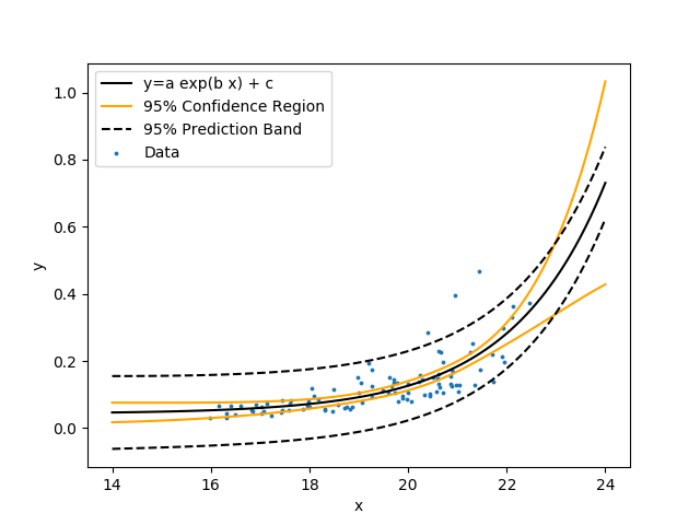
Create a nonlinear regression with unknown coefficients a, b, and c.
$$y = a \exp{\left(b\, x\right)} + c$$
Similar to the linear regression, fit the model to the data by minimizing the sum of squared errors between the predicted and measured y values. Show the nonlinear regression with 95% confidence bands and 95% prediction bands.
from scipy.optimize import curve_fit
import matplotlib.pyplot as plt
from scipy import stats
import pandas as pd
# pip install uncertainties, if needed
try:
import uncertainties.unumpy as unp
import uncertainties as unc
except:
try:
from pip import main as pipmain
except:
from pip._internal import main as pipmain
pipmain(['install','uncertainties'])
import uncertainties.unumpy as unp
import uncertainties as unc
# import data
url = 'http://apmonitor.com/che263/uploads/Main/stats_data.txt'
data = pd.read_csv(url)
x = data['x'].values
y = data['y'].values
n = len(y)
def f(x, a, b, c):
return a * np.exp(b*x) + c
popt, pcov = curve_fit(f, x, y)
# retrieve parameter values
a = popt[0]
b = popt[1]
c = popt[2]
print('Optimal Values')
print('a: ' + str(a))
print('b: ' + str(b))
print('c: ' + str(c))
# compute r^2
r2 = 1.0-(sum((y-f(x,a,b,c))**2)/((n-1.0)*np.var(y,ddof=1)))
print('R^2: ' + str(r2))
# calculate parameter confidence interval
a,b,c = unc.correlated_values(popt, pcov)
print('Uncertainty')
print('a: ' + str(a))
print('b: ' + str(b))
print('c: ' + str(c))
# plot data
plt.scatter(x, y, s=3, label='Data')
# calculate regression confidence interval
px = np.linspace(14, 24, 100)
py = a*unp.exp(b*px)+c
nom = unp.nominal_values(py)
std = unp.std_devs(py)
def predband(x, xd, yd, p, func, conf=0.95):
# x = requested points
# xd = x data
# yd = y data
# p = parameters
# func = function name
alpha = 1.0 - conf # significance
N = xd.size # data sample size
var_n = len(p) # number of parameters
# Quantile of Student's t distribution for p=(1-alpha/2)
q = stats.t.ppf(1.0 - alpha / 2.0, N - var_n)
# Stdev of an individual measurement
se = np.sqrt(1. / (N - var_n) * \
np.sum((yd - func(xd, *p)) ** 2))
# Auxiliary definitions
sx = (x - xd.mean()) ** 2
sxd = np.sum((xd - xd.mean()) ** 2)
# Predicted values (best-fit model)
yp = func(x, *p)
# Prediction band
dy = q * se * np.sqrt(1.0+ (1.0/N) + (sx/sxd))
# Upper & lower prediction bands.
lpb, upb = yp - dy, yp + dy
return lpb, upb
lpb, upb = predband(px, x, y, popt, f, conf=0.95)
# plot the regression
plt.plot(px, nom, c='black', label='y=a exp(b x) + c')
# uncertainty lines (95% confidence)
plt.plot(px, nom - 1.96 * std, c='orange',\
label='95% Confidence Region')
plt.plot(px, nom + 1.96 * std, c='orange')
# prediction band (95% confidence)
plt.plot(px, lpb, 'k--',label='95% Prediction Band')
plt.plot(px, upb, 'k--')
plt.ylabel('y')
plt.xlabel('x')
plt.legend(loc='best')
# save and show figure
plt.savefig('regression.png')
plt.show()
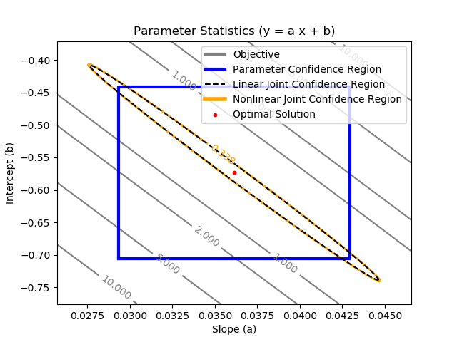
Joint Confidence Region - Linear Regression
The joint confidence region is shown by producing a contour plot of the SSE objective function with variations in the two parameters. The optimal solution is shown at the center of the plot and the objective function becomes worse (higher) away from the optimal solution.
import scipy as sp
from scipy import stats
from scipy.optimize import curve_fit
import matplotlib.pyplot as plt
import pandas as pd
# import data
url = 'http://apmonitor.com/che263/uploads/Main/stats_data.txt'
data = pd.read_csv(url)
x = data['x'].values
y = data['y'].values
def f(x, a, b):
return a * x + b
# perform regression
popt, pcov = curve_fit(f, x, y)
# retrieve parameter values
a = popt[0]
b = popt[1]
# calculate parameter stdev
s_a = np.sqrt(pcov[0,0])
s_b = np.sqrt(pcov[1,1])
# #####################################
# Single Variable Confidence Interval
# #####################################
# calculate 95% confidence interval
aL = a-1.96*s_a
aU = a+1.96*s_a
bL = b-1.96*s_b
bU = b+1.96*s_b
# calculate 3sigma interval
a3L = a-3.0*s_a
a3U = a+3.0*s_a
b3L = b-3.0*s_b
b3U = b+3.0*s_b
# #####################################
# Linear Joint Confidence Interval
# thanks to Trent Okeson
# #####################################
eigenval, eigenvec = np.linalg.eig(pcov)
max_eigenval = np.argmax(eigenval)
largest_eigenvec = eigenvec[:, max_eigenval]
largest_eigenval = eigenval[max_eigenval]
if max_eigenval == 1:
smallest_eigenval = eigenval[0]
smallest_eigenvec = eigenvec[:, 0]
else:
smallest_eigenval = eigenval[1]
smallest_eigenvec = eigenvec[:, 1]
angle = np.arctan2(largest_eigenvec[1], largest_eigenvec[0])
if angle < 0:
angle += 2*np.pi
chisquare_val = 2.4477
theta_grid = np.linspace(0, 2*np.pi)
phi = angle
a_rot = chisquare_val*np.sqrt(largest_eigenval)
b_rot = chisquare_val*np.sqrt(smallest_eigenval)
ellipse_x_r = a_rot*np.cos(theta_grid)
ellipse_y_r = b_rot*np.sin(theta_grid)
R = [[np.cos(phi), np.sin(phi)], [-np.sin(phi), np.cos(phi)]]
r_ellipse = np.stack((ellipse_x_r, ellipse_y_r)).T.dot(R)
final_ellipse = r_ellipse + popt[None, :]
# #####################################
# Nonlinear Joint Confidence Interval
# #####################################
# Generate contour plot of SSE ratio vs. Parameters
# meshgrid is +/- change in the objective value
m = 200
i1 = np.linspace(a3L,a3U,m)
i2 = np.linspace(b3L,b3U,m)
a_grid, b_grid = np.meshgrid(i1, i2)
n = len(y) # number of data points
p = 2 # number of parameters
# sum of squared errors
sse = np.empty((m,m))
for i in range(m):
for j in range(m):
at = a_grid[i,j]
bt = b_grid[i,j]
sse[i,j] = np.sum((y-f(x,at,bt))**2)
# normalize to the optimal solution
best_sse = np.sum((y-f(x,a,b))**2)
fsse = (sse - best_sse) / best_sse
# compute f-statistic for the f-test
alpha = 0.05 # alpha, confidence
# alpha=0.05 is 95% confidence
fstat = sp.stats.f.isf(alpha,p,(n-p))
flim = fstat * p / (n-p)
obj_lim = flim * best_sse + best_sse
# Create a contour plot
plt.figure()
CS = plt.contour(a_grid,b_grid,sse,[1,2,5,10],\
colors='gray')
plt.clabel(CS, inline=1, fontsize=10)
plt.xlabel('Slope (a)')
plt.ylabel('Intercept (b)')
# solid line to show confidence region
CS = plt.contour(a_grid,b_grid,sse,[obj_lim],\
colors='orange',linewidths=[2.0])
plt.clabel(CS, inline=1, fontsize=10)
# 2 dummy plots (gray,orange) for legend
plt.plot([aL,aL],[bL,bL],c='gray',\
LineWidth=3,label='Objective')
plt.plot([aL,aU,aU,aL,aL],[bL,bL,bU,bU,bL],c='blue',\
LineWidth=3,label='Parameter Confidence Region')
plt.plot(final_ellipse[:, 0], final_ellipse[:, 1], 'k--',\
label='Linear Joint Confidence Region')
plt.plot([aL,aL],[bL,bL],c='orange',\
LineWidth=4,\
label='Nonlinear Joint Confidence Region')
plt.scatter(a,b,s=10,c='red',marker='o',\
label='Optimal Solution')
plt.title('Parameter Statistics (y = a x + b)')
plt.legend(loc=1)
# Save the figure as a PNG
plt.savefig('contour.png')
plt.show()
The parameter confidence region is determined with an F-test that specifies an upper limit to the deviation from the optimal solution
$$\frac{SSE(\theta)-SSE(\theta^*)}{SSE(\theta^*)}\le \frac{p}{n-p} F\left(\alpha,p,n-p\right)$$
with p=2 (number of parameters), n=100 (number of measurements), `\theta`=[a,b] (parameters), `\theta`* as the optimal parameters, SSE as the sum of squared errors, and the F statistic that has 3 arguments (alpha=confidence level, degrees of freedom 1, and degrees of freedom 2). For many problems, this creates a multi-dimensional nonlinear confidence region. In the case of 2 parameters, the nonlinear confidence region is a 2-dimensional space.
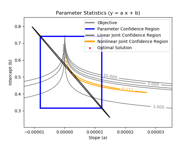
Joint Confidence Region - Nonlinear Regression
import scipy as sp
from scipy import stats
from scipy.optimize import curve_fit
import matplotlib.pyplot as plt
import pandas as pd
# import data
url = 'http://apmonitor.com/che263/uploads/Main/stats_data.txt'
data = pd.read_csv(url)
x = data['x'].values
y = data['y'].values
def f(x, a, b, c):
return a * np.exp(b*x) + c
# perform regression
popt, pcov = curve_fit(f, x, y)
# retrieve parameter values
a = popt[0]
b = popt[1]
c = popt[2]
# calculate parameter stdev
s_a = np.sqrt(pcov[0,0])
s_b = np.sqrt(pcov[1,1])
# #####################################
# Single Variable Confidence Interval
# #####################################
# calculate 95% confidence interval
aL = a-1.96*s_a
aU = a+1.96*s_a
bL = b-1.96*s_b
bU = b+1.96*s_b
# calculate 3sigma interval
a3L = a-3.0*s_a
a3U = a+3.0*s_a
b3L = b-3.0*s_b
b3U = b+3.0*s_b
# #####################################
# Linear Joint Confidence Interval
# thanks to Trent Okeson
# #####################################
eigenval, eigenvec = np.linalg.eig(pcov)
max_eigenval = np.argmax(eigenval)
largest_eigenvec = eigenvec[:, max_eigenval]
largest_eigenval = eigenval[max_eigenval]
if max_eigenval == 1:
smallest_eigenval = eigenval[0]
smallest_eigenvec = eigenvec[:, 0]
else:
smallest_eigenval = eigenval[1]
smallest_eigenvec = eigenvec[:, 1]
angle = np.arctan2(largest_eigenvec[1], largest_eigenvec[0])
if angle < 0:
angle += 2*np.pi
chisquare_val = 2.4477
theta_grid = np.linspace(0, 2*np.pi)
phi = angle
a_rot = chisquare_val*np.sqrt(largest_eigenval)
b_rot = chisquare_val*np.sqrt(smallest_eigenval)
ellipse_x_r = a_rot*np.cos(theta_grid)
ellipse_y_r = b_rot*np.sin(theta_grid)
R = [[np.cos(phi), np.sin(phi)], [-np.sin(phi), np.cos(phi)]]
r_ellipse = np.stack((ellipse_x_r, ellipse_y_r)).T.dot(R)
final_ellipse = r_ellipse + popt[None, 0:2]
# #####################################
# Nonlinear Joint Confidence Interval
# #####################################
# Generate contour plot of SSE ratio vs. Parameters
# meshgrid is +/- change in the objective value
m = 200
i1 = np.linspace(a3L,a3U*2.0,m)
i2 = np.linspace(b3L,b3U,m)
a_grid, b_grid = np.meshgrid(i1, i2)
n = len(y) # number of data points
p = 2 # number of parameters
# sum of squared errors
sse = np.empty((m,m))
for i in range(m):
for j in range(m):
at = a_grid[i,j]
bt = b_grid[i,j]
sse[i,j] = np.sum((y-f(x,at,bt,c))**2)
# normalize to the optimal solution
best_sse = np.sum((y-f(x,a,b,c))**2)
fsse = (sse - best_sse) / best_sse
# compute f-statistic for the f-test
alpha = 0.05 # alpha, confidence
# alpha=0.05 is 95% confidence
fstat = sp.stats.f.isf(alpha,p,(n-p))
flim = fstat * p / (n-p)
obj_lim = flim * best_sse + best_sse
# Create a contour plot
plt.figure()
CS = plt.contour(a_grid,b_grid,sse,[1,2,5,10],\
colors='gray')
plt.clabel(CS, inline=1, fontsize=10)
plt.xlabel('Slope (a)')
plt.ylabel('Intercept (b)')
# solid line to show confidence region
CS = plt.contour(a_grid,b_grid,sse,[obj_lim],\
colors='orange',linewidths=[2.0])
plt.clabel(CS, inline=1, fontsize=10)
# 2 dummy plots (gray,orange) for legend
plt.plot([aL,aL],[bL,bL],c='gray',\
LineWidth=3,label='Objective')
plt.plot([aL,aU,aU,aL,aL],[bL,bL,bU,bU,bL],c='blue',\
LineWidth=3,label='Parameter Confidence Region')
plt.plot(final_ellipse[:, 0], final_ellipse[:, 1], 'k-',\
label='Linear Joint Confidence Region')
plt.plot([aL,aL],[bL,bL],c='orange',\
LineWidth=4,\
label='Nonlinear Joint Confidence Region')
plt.scatter(a,b,s=10,c='red',marker='o',\
label='Optimal Solution')
plt.title('Parameter Statistics (y = a x + b)')
plt.legend(loc=1)
# Save the figure as a PNG
plt.savefig('contour.png')
plt.show()
Linear and nonlinear regression tutorials can also available in Python, Excel, and Matlab. A multivariate nonlinear regression case with multiple factors is available with example data for energy prices in Python. Click on the appropriate link for additional information.
