Data Analysis with Python
A common task for scientists and engineers is to analyze data from an external source that may be in a text or comma separated value (CSV) format.

By importing the data into Python, data analysis such as statistics, trending, or calculations can be made to synthesize the information into relevant and actionable information. Tutorials below demonstrate how to import data (including online data), perform a basic analysis, trend the results, and export the results to another text file. Two examples are provided with Pandas and Numpy.


Pandas Import and Export Data
url = 'http://apmonitor.com/pdc/uploads/Main/tclab_data2.txt'
data = pd.read_csv(url)
data.to_csv('file.csv')
Numpy Import and Export Data
data = np.loadtxt('file.csv',delimiter=',',skiprows=1)
np.savetxt('file2.csv',data,delimiter=',',\
comments='',header='Index,Time,Q1,Q2,T1,T2')
Additional script files with Python source code with sample data are below.
Import Data and Analyze with Numpy

import numpy as np
# Matplotlib (create trends)
import matplotlib.pyplot as plt
# load the data file
data_file = np.genfromtxt('data_file.txt', delimiter=',')
# create time vector from imported data (starts from index 0)
time = data_file[:,0]
# parse good sensor data from imported data
sensors = data_file[:,1:5]
# display the first 6 sensor rows
print(sensors[0:6])
# adjust time to start at zero by subtracting the
# first element in the time vector (index = 0)
time = time - time[0]
# calculate the average of the sensor readings
avg = np.mean(sensors,1) # over the 2nd dimension
# export data
# stack time and avg as column vectors
my_data = np.vstack((time,sensors.T,avg))
# transpose data
my_data = my_data.T
# save text file with comma delimiter
np.savetxt('export_from_python.txt',my_data,delimiter=',')
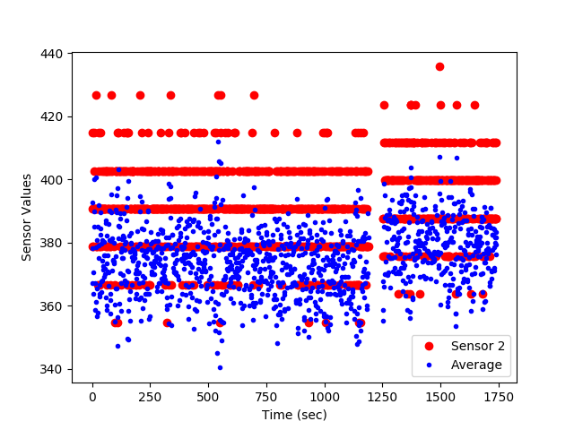
# generate a figure
plt.figure(1)
plt.plot(time/60.0,sensors[:,1],'ro')
plt.plot(time/60.0,avg,'b.')
# add text labels to the plot
plt.legend(['Sensor 2','Average Sensors 1-4'])
plt.xlabel('Time (min)')
plt.ylabel('Sensor Values')
# save the figure as a PNG file
plt.savefig('my_Python_plot.png')
# show the figure on the screen (pauses execution until closed)
plt.show()
Import Data and Analyze with Pandas
import numpy as np
import pandas as pd
import matplotlib.pyplot as plt
# load the data file
url='http://apmonitor.com/che263/uploads/Main/data_with_headers.txt'
data_file = pd.read_csv(url)
# create time vector from imported data
time = data_file['time']
# parse good sensor data from imported data
sensors = data_file.loc[:, 's1':'s4']
# display the first 6 sensor rows
print(sensors[0:6])
# or use: print(sensors.head(6))
# adjust time to start at zero by subtracting the
# first element in the time vector (index = 0)
time = time - time[0]
# calculate the average of the sensor readings
avg = np.mean(sensors,1) # over the 2nd dimension
# export data
my_data = [time, sensors, avg]
result = pd.concat(my_data,axis=1)
result.columns.values[-1] = 'avg'
result.to_csv('result.csv')
#result.to_excel('result.xlsx')
result.to_html('result.htm')
result.to_clipboard()
# generate a figure
plt.figure(1)
plt.plot(time,sensors['s1'],'r-')
plt.plot(time,avg,'b.')
# add text labels to the plot
plt.legend(['Sensor 2','Average'])
plt.xlabel('Time (sec)')
plt.ylabel('Sensor Values')
# save the figure as a PNG file
plt.savefig('my_Python_plot.png')
# show the figure on the screen
plt.show()
Import Online Data and Analyze
Below is an example of pulling data from an Internet source, such as financial information about a stock. The example shows how to request, parse, and display the financial data.
import matplotlib.pyplot as plt
# stock ticker symbol
url = 'http://apmonitor.com/che263/uploads/Main/goog.csv'
# import data with pandas
data = pd.read_csv(url)
print(data['Close'][0:5])
print('min: '+str(min(data['Close'][0:20])))
print('max: '+str(max(data['Close'][0:20])))
# plot data with pyplot
plt.figure()
plt.plot(data['Open'][0:20])
plt.plot(data['Close'][0:20])
plt.xlabel('days ago')
plt.ylabel('price')
plt.show()
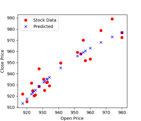
Once the data is imported, it can be analyzed with many different tools such as machine learning algorithms. Below is an example of using the data for analysis of correlation between open and close price of Google publicly traded shares.
import numpy as np
import matplotlib.pyplot as plt
import pandas as pd
# Google stock
url = 'http://apmonitor.com/che263/uploads/Main/goog.csv'
# import data with pandas
data = pd.read_csv(url)
print(data['Close'][0:5])
print('min: '+str(min(data['Close'][0:20])))
print('max: '+str(max(data['Close'][0:20])))
# GEKKO model
m = GEKKO()
# input data
x = m.Param(value=np.array(data['Open']))
# parameters to optimize
a = m.FV()
a.STATUS=1
b = m.FV()
b.STATUS=1
c = m.FV()
c.STATUS=1
# variables
y = m.CV(value=np.array(data['Close']))
y.FSTATUS=1
# regression equation
m.Equation(y==b*m.exp(a*x)+c)
# regression mode
m.options.IMODE = 2
# optimize
m.options.solver = 1
m.solve(disp=True)
# print parameters
print('Optimized, a = ' + str(a.value[0]))
print('Optimized, b = ' + str(b.value[0]))
print('Optimized, c = ' + str(c.value[0]))
# plot data
plt.figure()
plt.plot(data['Open'],data['Close'],'ro',label='Stock Data')
plt.plot(x.value,y.value,'bx',label='Predicted')
plt.xlabel('Open Price')
plt.ylabel('Close Price')
plt.legend()
plt.show()
This tutorial can also be completed with Excel and Matlab. Click on the appropriate link for additional information.
Generative AI Learning
Use these prompts to test your understanding after completing the tutorial. Run the full pattern on a data pipeline: specify the import-analyze-export workflow, let the AI generate it, verify against hand calculations, and defend the conclusions.
Modern data: Swap in a renewable-energy time series (hourly wind or solar output for a month - many grid operators publish these as CSV). The same pipeline answers real questions: capacity factor (mean/nameplate), the worst 24-hour lull, and day-vs-night statistics. The import-verify-summarize workflow is identical; only the engineering questions get more interesting.
What to Turn In
Submit a short report (PDF, 1-2 pages) that curates your results into a demonstration of what you learned. You may use Generative AI to help write the report, but you must guide it to the correct visualizations, justifications, and assumptions. Answer these questions:
- Describe your data set (source, rows, columns, units) and include the raw-data plot you made before any statistics.
- Report the summary statistics and one derived quantity (e.g., capacity factor or daily average), with the hand calculation on the first 5 rows that verifies the pipeline.
- Include your spec and the AI's open-assumptions list. Which assumption, left uncaught, would have changed an engineering conclusion?
- Show the exported results file (screenshot of the CSV/Excel output) and state one conclusion the analysis supports and one it does NOT support.
- From the quiz prompt: one question you missed and the corrected answer.
