With the rapid spread of the disease COVID-19, epidemiologists have devised a strategy to "flatten the curve" by applying various levels of social distancing (sd). The strategy is to reduce the transmission of the virus SARS-CoV-2 so that the healthcare system is not overburdened.
Social distancing lowers the total number of people who are infected to keep hospitals below full capacity and reduces the total cumulative infected.
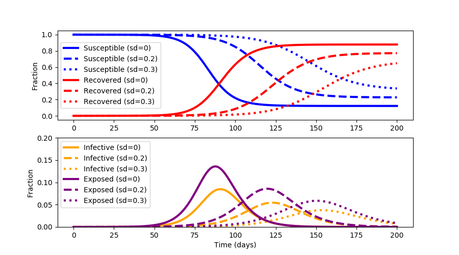
Social distancing also minimizes the pandemic until a vaccine or effective treatments can be developed.
Economic Considerations
One of the downsides of extended social distancing is economic disruption where businesses fail, unemployment rises, supplies become scare, and assistance is needed to provide for the most vulnerable. Repeated outbreak cycles over multiple years are common when the virus mutates and the fraction of susceptible individuals is high. The objective of this exercise is to not just "flatten the curve" but to optimize social distancing to minimize the outbreak time and keep healthcare services below full capacity.
SEIR Compartmental Model
The fraction of Susceptible, Exposed, Infected, and Recovered (SEIR) population is given by a compartmental model with four differential equations.
$$\frac{ds}{dt} = -(1-u)\beta s i$$ $$\frac{de}{dt} = (1-u)\beta s i - \alpha e $$ $$\frac{di}{dt} = \alpha e - \gamma i $$ $$\frac{dr}{dt} = \gamma i$$
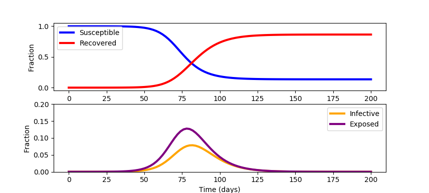
This model is a simplification and neglects mortality and birth rates. There is also an opportunity to update the model with data sources such as search engine queries to improve early identification of regional outbreaks. Outbreak data on cruise ships give a controlled study to better assess under-reported cases. The model also neglects the variable fraction of infected patients that will need healthcare services. This fraction depends on how well vulnerable populations such as the elderly or immuno-compromised patients are protected. See COVID-19 SEIR Modeling for a simulation of infectious disease spread. Jeff Kantor's simulation model also shows the effect of social distancing (u=0 (none), u=1 (total isolation)) and other ways to alter the outcome. A starting simulation model in Python Gekko predicts the response with a single social distancing factor (u==0) for 200 days for a population of 100,000.
from gekko import GEKKO
import matplotlib.pyplot as plt
t_incubation = 5.1
t_infective = 3.3
R0 = 2.4
N = 100000
# initial number of infected and recovered individuals
e_initial = 1/N
i_initial = 0.00
r_initial = 0.00
s_initial = 1 - e_initial - i_initial - r_initial
alpha = 1/t_incubation
gamma = 1/t_infective
beta = R0*gamma
m = GEKKO()
u = m.FV(0)
s,e,i,r = m.Array(m.Var,4)
s.value = s_initial
e.value = e_initial
i.value = i_initial
s.value = s_initial
m.Equations([s.dt()==-(1-u)*beta * s * i,\
e.dt()== (1-u)*beta * s * i - alpha * e,\
i.dt()==alpha * e - gamma * i,\
r.dt()==gamma*i])
t = np.linspace(0, 200, 101)
t = np.insert(t,1,[0.001,0.002,0.004,0.008,0.02,0.04,0.08,\
0.2,0.4,0.8])
m.time = t
m.options.IMODE=7
m.solve(disp=False)
# plot the data
plt.figure(figsize=(8,5))
plt.subplot(2,1,1)
plt.plot(m.time, s.value, color='blue', lw=3, label='Susceptible')
plt.plot(m.time, r.value, color='red', lw=3, label='Recovered')
plt.ylabel('Fraction')
plt.legend()
plt.subplot(2,1,2)
plt.plot(m.time, i.value, color='orange', lw=3, label='Infective')
plt.plot(m.time, e.value, color='purple', lw=3, label='Exposed')
plt.ylim(0, 0.2)
plt.xlabel('Time (days)')
plt.ylabel('Fraction')
plt.legend()
plt.show()
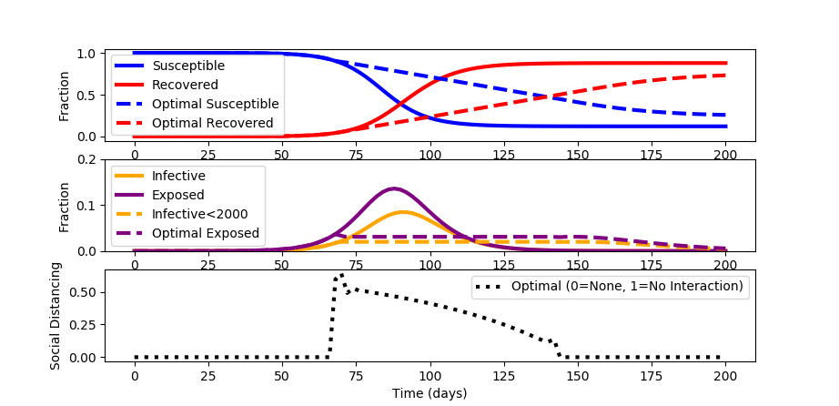
Flatten Optimize the Curve
When a constant social distancing policy is enforced, the outbreak peaks before receding. The constant social distancing also creates undue economic damage. Devise an optimal distancing policy that changes over time to not only flatten the curve but also optimize to available healthcare constraints.
For this case study, assume that the number of infected must stay below 2000 (i<0.02) to keep healthcare below full capacity. Minimize social distancing to decrease economic disruption. Assume that the maximum achievable social distancing is 0.8.
Python (GEKKO) Solution
The source code for the solution is shown below. A simulation is used to initialize the optimization problem to determine the best social distancing strategy that is adjusted every two days.
While the spread of the disease is longer in duration than with no social distancing, a maximum of only 2% of the population is infective and 3.5% are exposed at any time.
from gekko import GEKKO
import matplotlib.pyplot as plt
t_incubation = 5.1
t_infective = 3.3
R0 = 2.4
N = 100000
# fraction of infected and recovered individuals
e_initial = 1/N
i_initial = 0.00
r_initial = 0.00
s_initial = 1 - e_initial - i_initial - r_initial
alpha = 1/t_incubation
gamma = 1/t_infective
beta = R0*gamma
m = GEKKO()
u = m.MV(0,lb=0.0,ub=0.8)
s,e,i,r = m.Array(m.Var,4)
s.value = s_initial
e.value = e_initial
i.value = i_initial
r.value = r_initial
m.Equations([s.dt()==-(1-u)*beta * s * i,\
e.dt()== (1-u)*beta * s * i - alpha * e,\
i.dt()==alpha * e - gamma * i,\
r.dt()==gamma*i])
t = np.linspace(0, 200, 101)
t = np.insert(t,1,[0.001,0.002,0.004,0.008,0.02,0.04,0.08,\
0.2,0.4,0.8])
m.time = t
# initialize with simulation
m.options.IMODE=7
m.options.NODES=3
m.solve(disp=False)
# plot the prediction
plt.figure(figsize=(8,5))
plt.subplot(3,1,1)
plt.plot(m.time, s.value, color='blue', lw=3, label='Susceptible')
plt.plot(m.time, r.value, color='red', lw=3, label='Recovered')
plt.subplot(3,1,2)
plt.plot(m.time, i.value, color='orange', lw=3, label='Infective')
plt.plot(m.time, e.value, color='purple', lw=3, label='Exposed')
# optimize
m.options.IMODE=6
i.UPPER = 0.02
u.STATUS = 1
m.options.SOLVER = 3
m.options.TIME_SHIFT = 0
s.value = s.value.value
e.value = e.value.value
i.value = i.value.value
r.value = r.value.value
m.Minimize(u)
m.solve(disp=True)
# plot the optimized response
plt.subplot(3,1,1)
plt.plot(m.time, s.value, color='blue', lw=3, ls='--', label='Optimal Susceptible')
plt.plot(m.time, r.value, color='red', lw=3, ls='--', label='Optimal Recovered')
plt.ylabel('Fraction')
plt.legend()
plt.subplot(3,1,2)
plt.plot(m.time, i.value, color='orange', ls='--', lw=3, label='Infective<2000')
plt.plot(m.time, e.value, color='purple', ls='--', lw=3, label='Optimal Exposed')
plt.ylim(0, 0.2)
plt.ylabel('Fraction')
plt.legend()
plt.subplot(3,1,3)
plt.plot(m.time, u.value, 'k:', lw=3, label='Optimal (0=None, 1=No Interaction)')
plt.ylabel('Social Distancing')
plt.legend()
plt.xlabel('Time (days)')
plt.show()
References
- Kantor, J., Modeling and Control of a Campus COVID-19 Outbreak, 2020, Video Link.
- Keeling, Matt J., and Pejman Rohani. Modeling Infectious Diseases in Humans and Animals. Princeton University Press, 2008. JSTOR, www.jstor.org/stable/j.ctvcm4gk0. Accessed 25 Feb. 2020.
- Pan, Jinhua, et al. Effectiveness of control strategies for Coronavirus Disease 2019: a SEIR dynamic modeling study. medRxiv (2020).
- Peng, Liangrong, et al. Epidemic analysis of COVID-19 in China by dynamical modeling. arXiv preprint arXiv:2002.06563 (2020).
- Cook, S., et al., Assessing Google flu trends performance in the United States during the 2009 influenza virus A (H1N1) pandemic, PloS one 6(8): e23610, 2011.
- Ginsberg, J., et al., Detecting influenza epidemics using search engine query data, Nature 457.7232: 1012-1014, 2009.
- Word, D.P., Abbott, G.H., Cummings, D., Laird, C.D., Estimating seasonal drivers in childhood infectious diseases with continuous time and discrete-time models, Proc. 2010 American Control Conference, Baltimore, MD, 5137-5142, June 2010.
- Beal, L.D.R., Hill, D., Martin, R.A., and Hedengren, J. D., GEKKO Optimization Suite, Processes, Volume 6, Number 8, 2018, doi: 10.3390/pr6080106.
- Hedengren, J.D., Asgharzadeh Shishavan, R., Powell, K.M., Edgar, T.F., Nonlinear Modeling, Estimation and Predictive Control in APMonitor, Computers and Chemical Engineering, 70, 133–148, doi:10.1016/j.compchemeng.2014.04.013, 2014.
- Lewis, N.R., Hedengren, J.D., Haseltine, E.L., Hybrid Dynamic Optimization Methods for Systems Biology with Efficient Sensitivities, Processes 3:3, 701-729, doi:10.3390/pr3030701, 2015.
- Carneiro, H.A., Mylonakis, E., Google trends: a web-based tool for real-time surveillance of disease outbreaks, Clinical infectious diseases 49.10: 1557-1564, 2009.
- Vishal S. Arora, Martin McKee, David Stuckler, Google Trends: Opportunities and limitations in health and health policy research, Health Policy, 123: 3, 2019, 338-341, 2019.
- Abbott, C.S., Haseltine, E.L., Martin, R.A., Hedengren, J.D., New Capabilities for Large-Scale Models in Computational Biology, Computing and Systems Technology Division, AIChE National Meeting, Pittsburgh, PA, Oct 2012.
- Polwiang, S., The seasonal reproduction number of dengue fever: impacts of climate on transmission, PeerJ 3:e1069, doi:10.7717/peerj.1069, 2015.
- Word, D.P., et al. Interior-point methods for estimating seasonal parameters in discrete-time infectious disease models, PloS one 8.10: e74208, 2013.